DATASET
Which dataset you want to use?
Concentration (50)
Amount of data to sample?
Noise (200)
How much noise?
POLYNOMIAL DEG (4)
What degree basis to fit?
Steps:
- Choose a dataset from the pane on the left.
- Analyze bias-variance tradeoff by changing data/ noise/ samples.
- Investigate different fits by changing the degree of the polynomial.
- Use the zoom-out symbol to see generalizability of your model
Discussion
What is polynomial regression?
Linear regression is a technique for modeling a dependent variable (y) as a linear combination of one or more independent variables x(i)). Polynomial regression allows us to capture non-linear relationships between X and y using a change of basis (z(i)=f(x(i))). In a nutshell, instead of a line, it allows us to fit a nth degree polynomial to the data. Read more [link].
What is the aim of this playground?
Tinker with different values of parameters like polynomial degree (p), noise, and amount of sampling. Each value of the parameters result in a slightly different model in the bias-variance tradeoff landscape. The aim is to demonstrate the fundamental tradeoff, and relate it with overfitting/ underfitting and generalization error.
What is the bias and variance? How do you compute it?
Imagine, we can rebuild different models by repeatedly sampling new data. Due to noise, we may end up with a slightly different model. The bias for particular prediction corresponds to the difference between its expected value and its true value. The variance corresponds to the spread of these predictions. Read more [link]. We compute the bias and variance of the whole model by averaging bias and variance of all data points in the dataset.
What is bias-variance tradeoff?
The tradeoff is in the sense that when you tweak the model parameters (degree of polynomial in this case), a decrease in one type of error leads to increase in the other and vice versa.
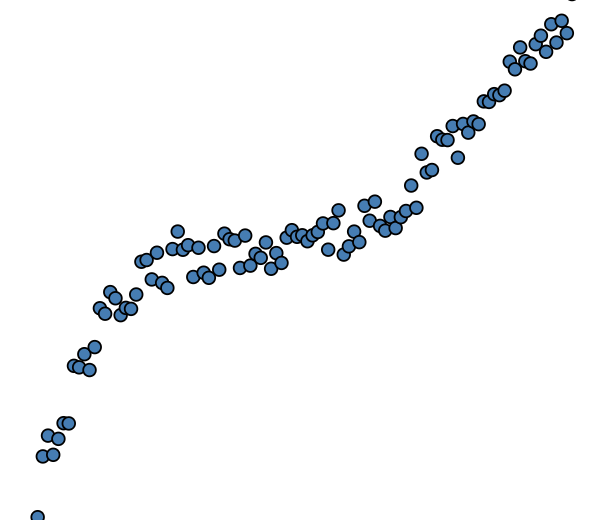
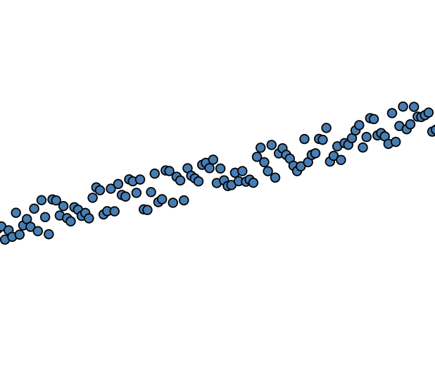
Scatter plot; how to interpret it?
The scatter plot represents a single snapshot of the data (shown as blue dots). We fit an nth degree polynomial regression line to it (shown in pink).
You can observe the bias-variance tradeoff by observing different fits for the same dataset. Notice that you get quite different fit for a higher degree polynomial (high variance) while you get the same model for a low degree polynomial (low variance). On the other hand, a high degree polynomial closely fits more number of points, hence the bias is low. While a low degree polynomial does not have this expressivity leading to high bias.
Box plot; how to interpret it?
Box plot is generated by plotting the distribution of residuals (absolute difference between predictions of the model and its actual value). Each bar corresponds to a different degree of a polynomial. Notice, a bar close to bottom represents low residuals (on average). Hence, the bias of the model is low. On the other hand, the height of a bar gives an idea of the spread of residuals, giving us an estimate of variance. These two things roughly correspond to bias and variance of the model. Notice, as the model degree increases, the bars shifts downwards (low bias) and the height of bars increases (high variance).
Bar plot; how to interpret it?
The bar chart is generated by computing the bias and variance of the model. Each bar corresponds to bias and variance of the model for a particular degree of the polynomial. Notice as you go right (increase in polynomial degree), the bias of the model decreases and the variance increases. On the other hand, if we go left (model degree decreases), the bias of the model increases and the variance decreases.
But, why did not you plot the bull's eye diagram?
One of my colleague did it another playground [link]. The bulls's eye visualization idiom (originally proposed here [link]) is intuitive but not very accurate. It can be misleading since both bias and variance are really an one-dimentional quantity. Read our project report for more details [link]. Also, feel free to suggest any changes by submitting a pull request here [link]